
How to Increase Conversion Rates: Landing Page Tips for eCommerce and Lead Generation
- Landing Pages
- Digital Marketing
- September 17, 2024
Do you want to increase conversions on your landing pages? Of course you do!
Luckily, boosting conversions can be as easy as a few simple design tweaks. Read on for our list of proven tips for updating your landing pages. It’s time to turn your visitors into customers.
Sections
1. Use high-quality images and video
First impressions matter. High-quality images and videos not only grab attention, but they help visitors better understand your product or service. Use clear, crisp visuals that showcase your products from multiple angles to create trust and build engagement.
2. Highlight deals and current promotions
Everyone loves a good deal! Make sure your landing page highlights any active discounts or promotions. Bonus points if you show them off in a different color. This creates urgency and incentivizes customers to complete their purchase right away. Check out this example from Etsy:

3. Show off your ratings and reviews
Consumers trust other customers more than they trust businesses. Displaying product ratings and customer reviews prominently on your landing page helps build credibility and reassures potential buyers that they’re making the right decision.
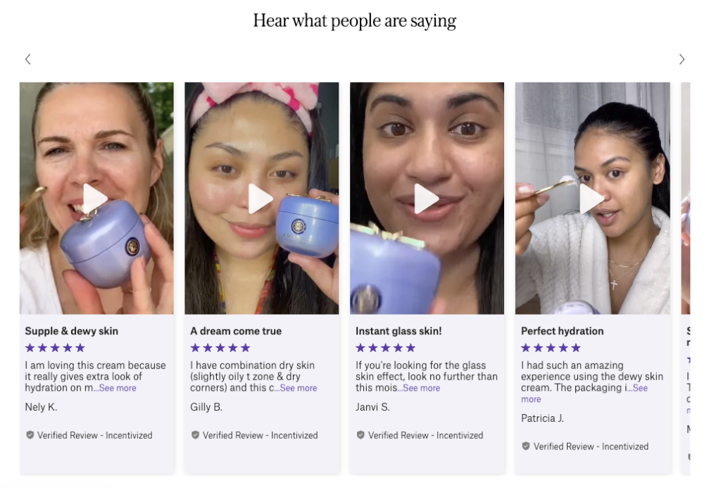
4. Offer more social proof
Adding more social proof such as user-generated images, “bestseller” designations, or a tally of how many people have purchased the product this month can further increase trust. This simple technique demonstrates your product’s popularity and convinces visitors that others are enjoying it, too. Tatcha shows off its video reviews:
5. Share the price in a smaller, red font
Psychological pricing hacks can influence customer perception. Experiment with displaying the price in a smaller, red font to give the impression that it’s a better deal. Research shows that red is associated with discounts, and smaller fonts can subtly make the price feel less significant. This must explain why Amazon often uses red to show its prices:
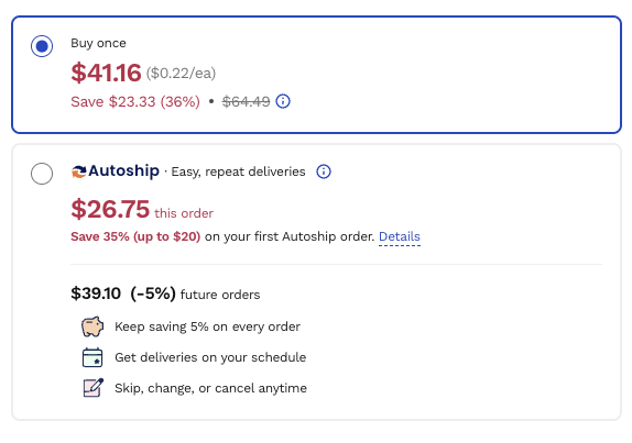
6. Let people subscribe for more savings
Make it easy for visitors to subscribe and get ongoing savings. Get the benefits across quickly, whether it’s an ongoing discount or the convenience of automatic reorders. Here’s a great example from Chewy:
7. Make it easy to bookmark products to buy later
Allow visitors to “heart” or save products to a wishlist. This gives users a low-pressure option to return later, and you can re-engage them through reminder emails or push notifications to nudge them toward conversion.
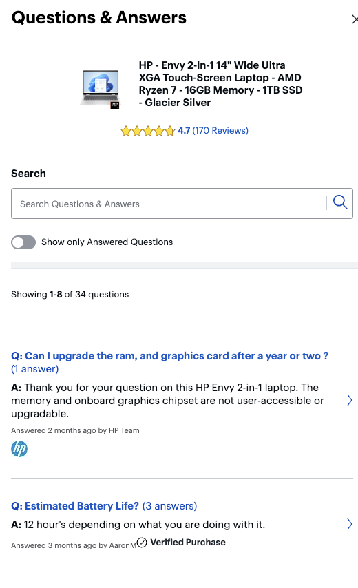
8. Include a product FAQ section
A searchable FAQ section can address any concerns customers may have before buying. Common questions about product details, shipping, or returns can be answered upfront, eliminating hesitation and increasing confidence in making a purchase. Best Buy even allows shoppers to filter for “Answered Questions” only:
9. Use a clear CTA with a bright-colored button
Your call-to-action (CTA) button can make or break your conversion rate. It should be bold and easy to find. Use a bright color that contrasts with the rest of the page with a clear, actionable phrase like “Buy Now” or “Sign Up Today.”
10. Make customer support easy to find
Your customer support options—whether it’s email, phone, or text—should be easily accessible. When customers know there’s someone they can contact for help, they feel more comfortable making a purchase.
11. Include a call-out for live chat
Live chat has become standard for customer support. Including a live chat option ensures that visitors with last-minute questions or concerns can get answers in real-time, reducing friction and helping them convert sooner.
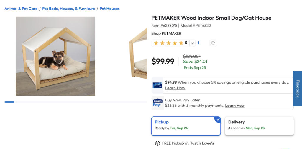
12. Overcommunicate shipping and delivery times
Include an expected delivery date on the product page or at checkout to manage customer expectations, reduce potential frustration, and get people excited about their purchase. Lowe’s does a great job with this:
13. Explain your return and exchange policy
Be transparent about your return and exchange policy. Customers appreciate knowing that they have a hassle-free option if they need to return or exchange an item. Clearly stating this policy helps reduce hesitation and fosters trust.
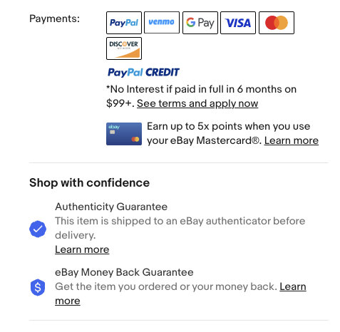
14. Offer a variety of payment options
Give your customers flexibility at checkout by offering a variety of payment methods. Whether it’s credit cards, PayPal, or buy-now-pay-later options, the easier you make it for customers to complete their purchase, the better. eBay shares its payment options with logos, so it’s super easy for shoppers to know how they can pay:
15. Display security badges at checkout
Trust is everything when it comes to online purchases. Displaying security badges, SSL certificates, or “verified by” symbols during checkout reassures customers that their information is safe, which can significantly reduce cart abandonment.
Convert more buyers with these landing page tips
By incorporating these tips into your landing page, you can create a seamless shopping experience that not only drives conversions but builds long-term loyalty.
Want a more personal touch? Contact the conversion experts at Your Marketing People for personalized advice on how to revamp your landing pages for success.


Recent Comments