Using Color Psychology to Build Your Brand Color Guide
- Branding, eCommerce, Marketing Tips
- podcast
- May 28, 2020
Sections
Using Color Psychology to Build Your Brand Color Guide
Take a moment and consider this: When people hear your brand name, what do you want them to think, feel, believe?
When they visit your website, view your marketing materials, or open up your product packaging, the same question holds. What feeling do you want your brand to evoke when people see and interact with it?
Your answer will dictate your branding color guide.
Choosing your brand color palette
Your brand color palette is a group of colors that define your brand. These appear in your logo, throughout your website and printed materials, and on your packaging and event collateral. Sticking to a color palette helps you create consistency, a key element to successful branding.
Most color palettes include both primary and secondary colors. Primary colors are 1 to 3 colors you use in your logo, while the secondary color palette can be much larger, featuring colors that complement your primary brand colors.
Having a broader group of colors gives you more to work with when designing your visual branding. You’ll establish a visual hierarchy for your content, helping orient customers to what they should pay attention to. With more colors, you’re also able to achieve sufficient color contrast on your website, a requirement for businesses who must meet ADA compliance.
At Your Marketing People, red is one of our primary colors. It’s the defining color of our brand. We use this in our logo, and anything else we really want people to pay attention to, like a link or a call-to-action button.

We also use secondary colors of black, gray, white, and navy throughout our site.

When choosing your brand colors, you’ll define them by their HEX or RGB color codes. These are the identifiers for the exact colors you choose, so you never have to worry about something looking just a bit “off.”
Once you’ve defined your brand colors, you’ll assign them different purposes, such as whether a color is defined to a function (like a link or button) or represents a theme (like your informational resources vs. your landing pages). Then, you can document them in your style guide. Here’s an example from HubSpot:

What primary and secondary colors will you choose for your brand? The next section will help you decide.
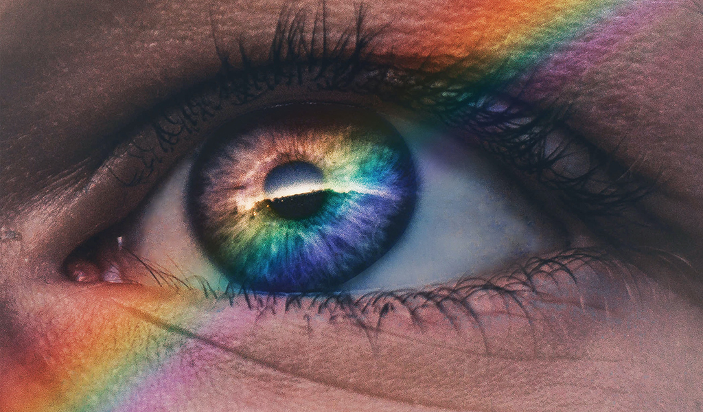
Using color psychology to guide your branding colors
Different colors represent different emotions. Many brands choose colors to evoke the emotions they want customers to feel when thinking about their brand.
- Red evokes excitement and commands attention. It’s a great color for driving importance and urgency.
- Yellow is another attention-grabbing color, but with less intensity than red. The color of the sun, this cheery color evokes optimism.
- Orange is an energetic color, often used to represent active or friendly brands.
- Green is a strong color that represents growth. This color denotes prosperity and health, whether natural or financial.
- Blue is a trustworthy color often favored by brands in the technology, financial, or health space. Lighter hues feel more open and playful, while darker hues feel more formal and serious.
- Purple is an individualistic color that taps into the creative spirit. It can also represent royalty, so you’ll see it with higher-end brands.
- Pink, especially lighter shades, feel happy, feminine, and youthful. They often appear with female-targeted brands, but not always — as seen with Lyft’s bold, bright pink.
- Brown feels rugged and earthy, perfect for any brand in touch with nature. Sepia tones in particular can reflect a more old-fashioned or vintage-leaning brand.
- White is clean and pure. Its pristine feel is favored by luxury brands (Apple comes to mind) as well as those in healthcare.
- Gray is as neutral as it gets, and that’s a good thing! This classic color isn’t offensive on the eyes, feels responsible, and lends a bit of mystery to your brand.
- Black is the strongest color of all. Like red, it leaves an impression. Black is favored by brands who want to be modern, powerful, and luxurious.

Pro Tip: For more ideas, head on over to Pinterest! Search for color palettes, and you’ll find a lot of mixes that you can pull inspiration from.
Building your brand color guide
Picking out your branding colors is a lot of fun, but there’s definitely an art to getting it right. For help establishing a color guide that brings your brand to life, contact us. From branding to graphic design, we’re here to strengthen your brand. Learn more about our creative services.


Recent Comments